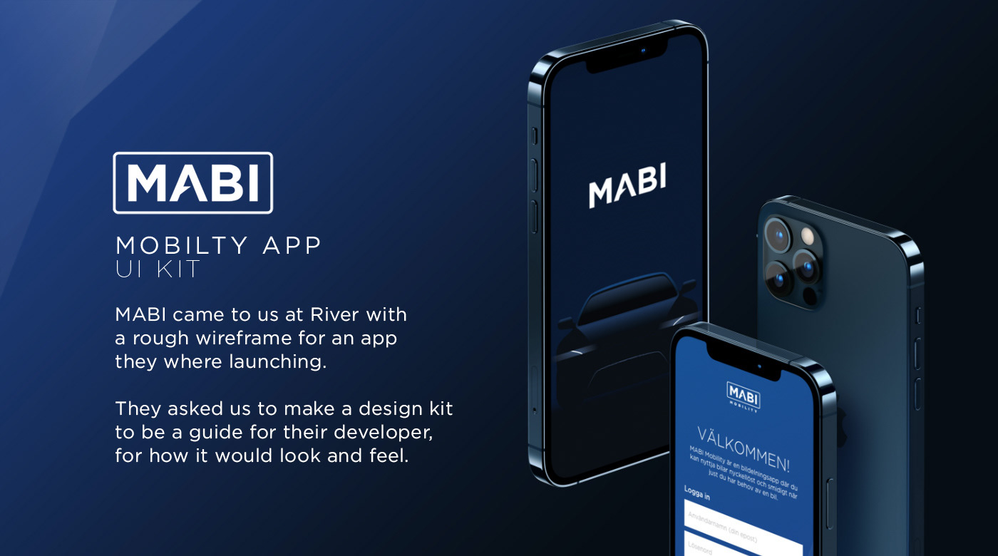
DEBRIEF
I was tasked to make a UI kit, a few key screens as well as some visual identity screens. The app is for the Swedish market therefor some examples are in Swedish.
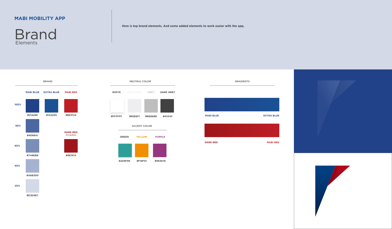
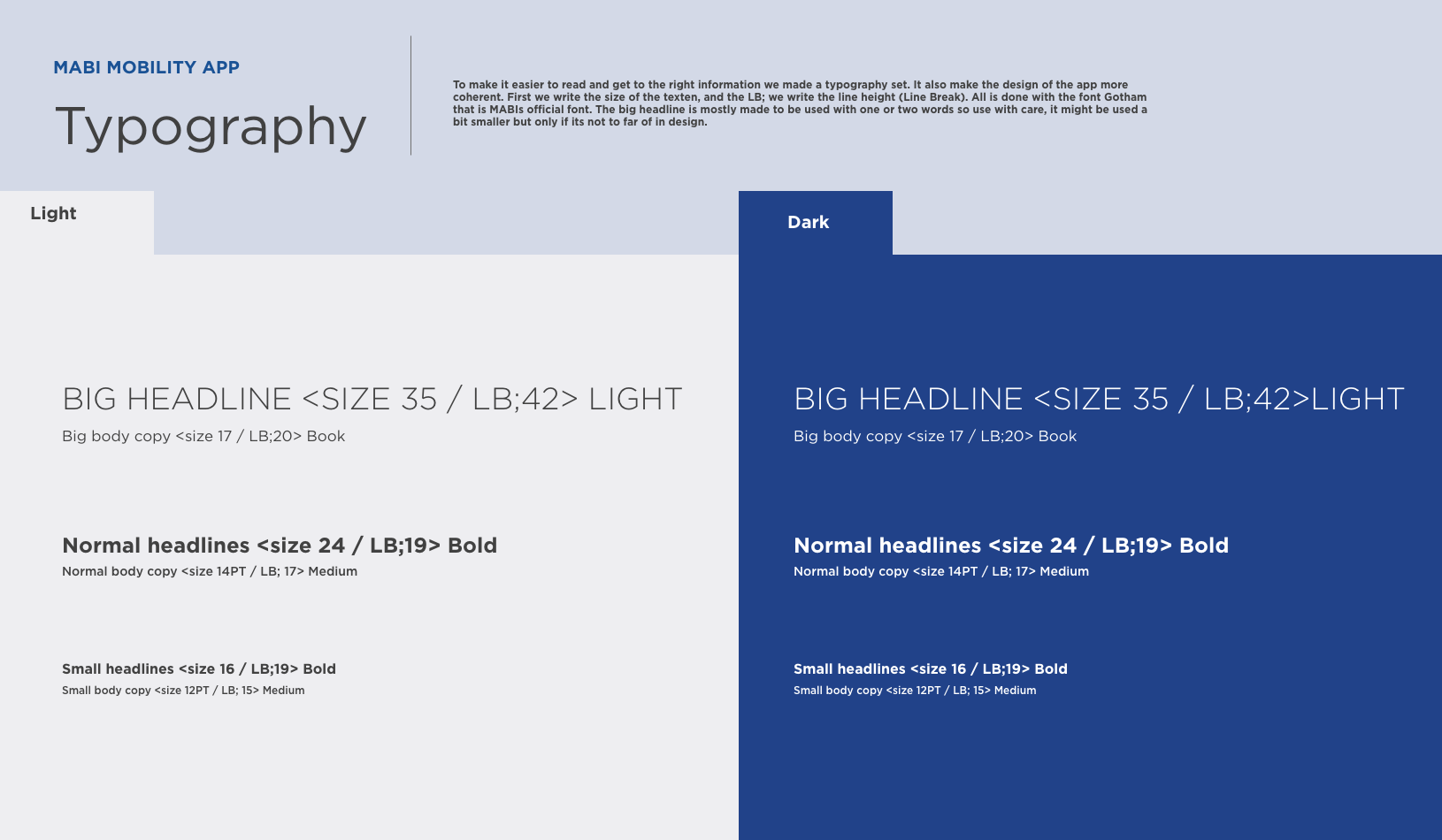
UI KIT
On every page you will find instructions to the developer and I think its a quite good read here on Behance as well to show what decisions we took and why.


KEY SCREENS
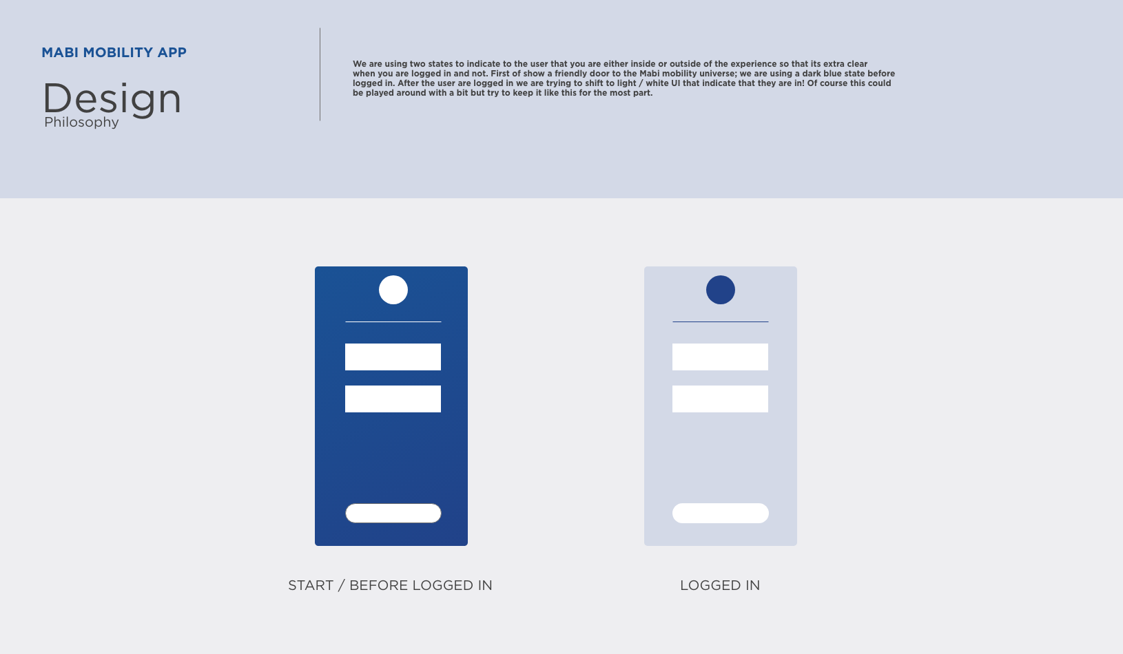
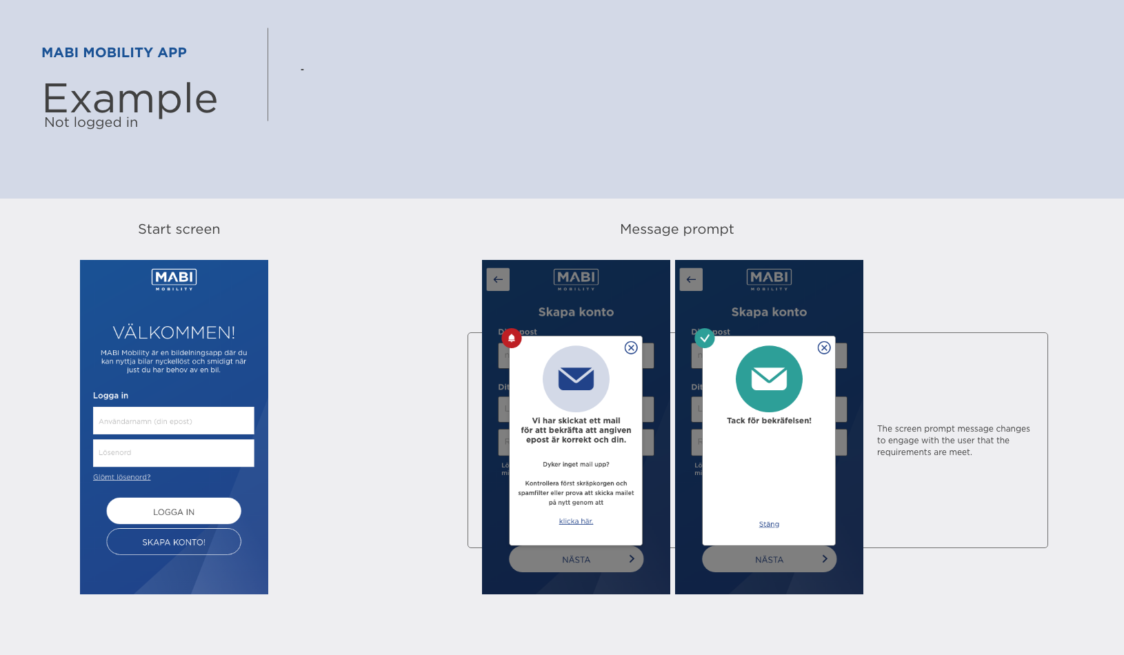
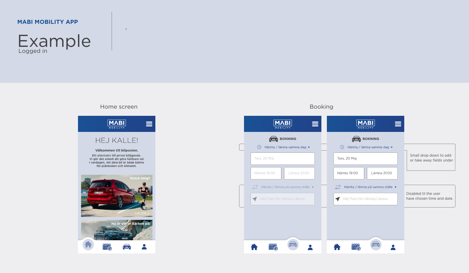
We decided to make a bit of "key" screens, showing how the app will look when it starts as it's one of the most critical part to give it feeling for the user before they created an account. The wire frame did not have any starts up screens so we feel like this also complemented to what was missing as a design instruction for the developer.

It felt necessary to show how all design decisions where put together in both a state where the user is logged in / and not logged in. Thus we made the following slides and with some info how it would behave.
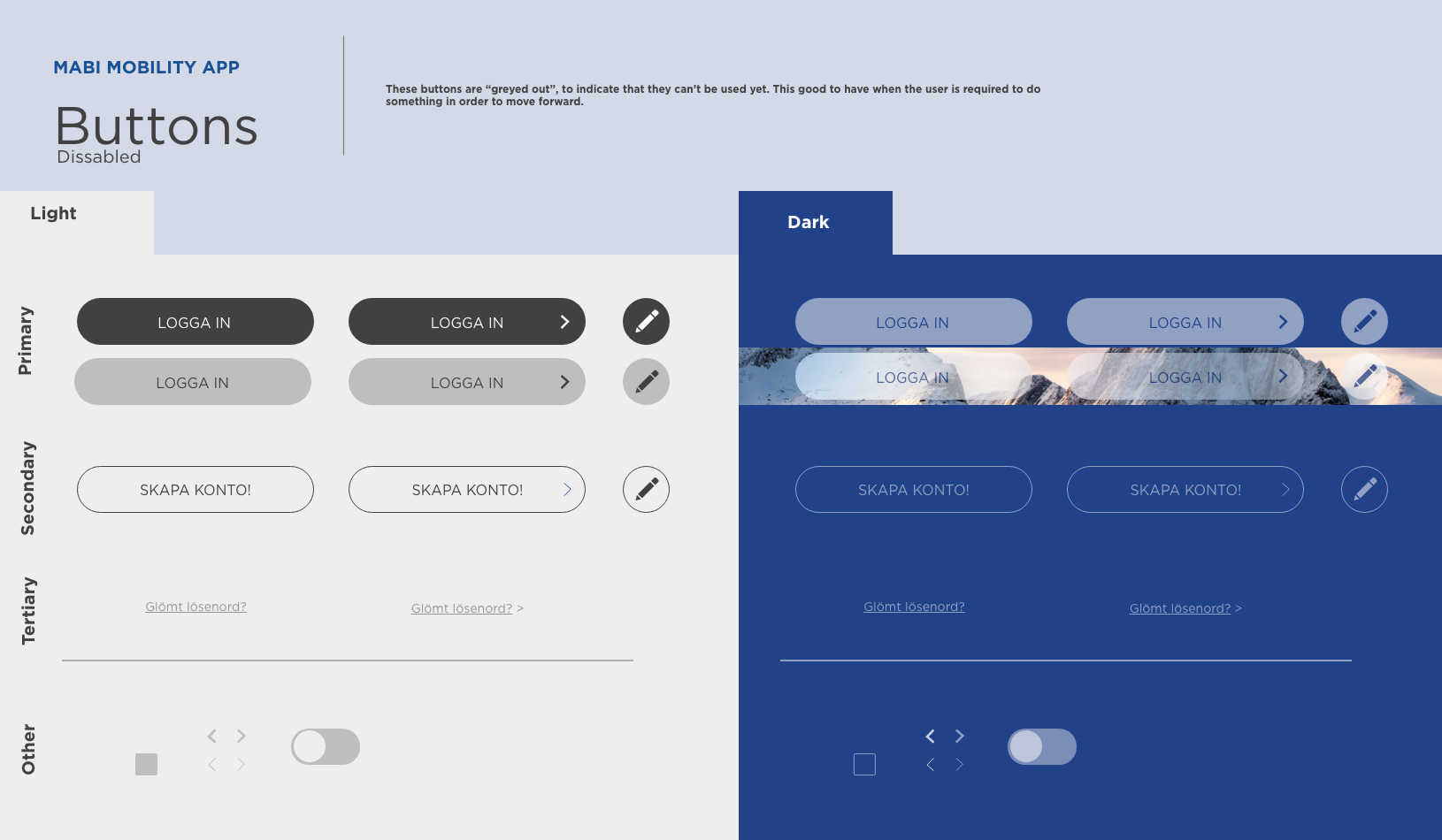
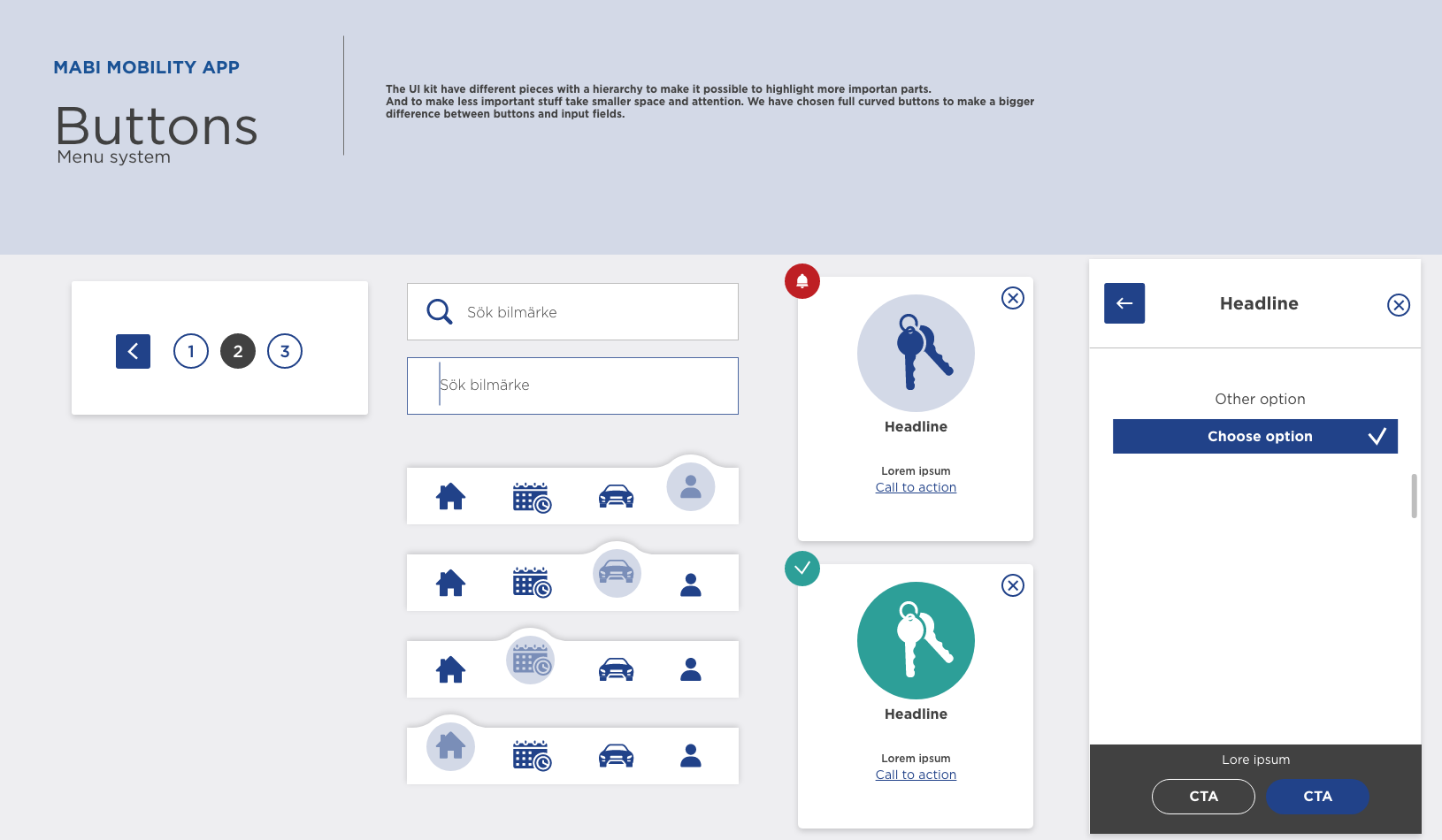
One thing that where missing in the original wire frame was primary and secondary buttons, as well as enable and disabled buttons. This was big UX lift so that we can help the user to see the most import thing and what to expected next of the user.
THE ICON
We where contacted again by MABI at later state to make the icon for the app.
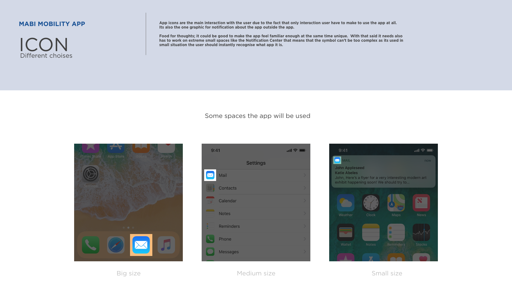
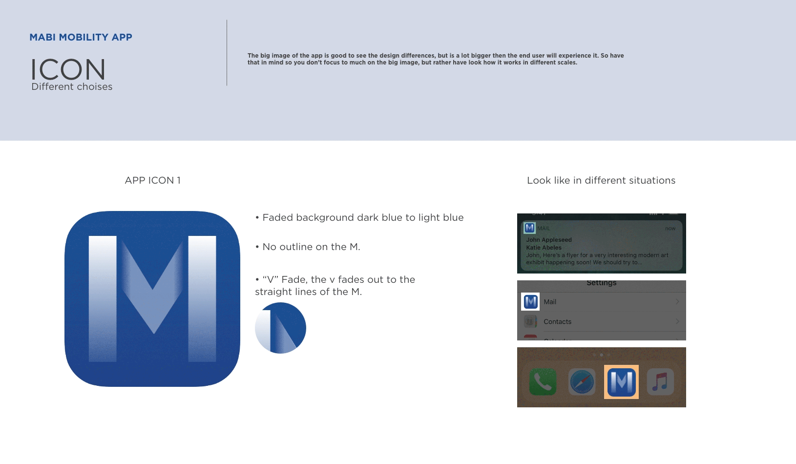
I started the work with the mind set that it should be visually near to the apps identity and work in extremely small spaces like the notification center on a phone.
I started the work with the mind set that it should be visually near to the apps identity and work in extremely small spaces like the notification center on a phone.
That's a lot smaller than the home screen size, and it should still be instantly recognisable. Combined with a graphical symbol or relation to the app as function or brand. Yes you guessed right its a bit boxed in a corner with curved edges (Pun intended).
I added some examples of how the icons is used to the client to make sure they where on board with the limitations of an icons design. After all its most important interaction since it the only interaction all users must interact with, to use the app.